HeyJobs is a job search platform based out of Germany. User research suggested that a brand revamp could help HeyJobs connect a bit more emotionally with its audience and cater better to the younger age group. This led to a rebranding, which in turn had to be translated to the design system.
What did I do?
UI audit to understand existing design system implementation.
Collaborate with tech team to understand implementation challenges.
Collaborate with the Brand Design team to gather the different branding components and translate it to the UI.
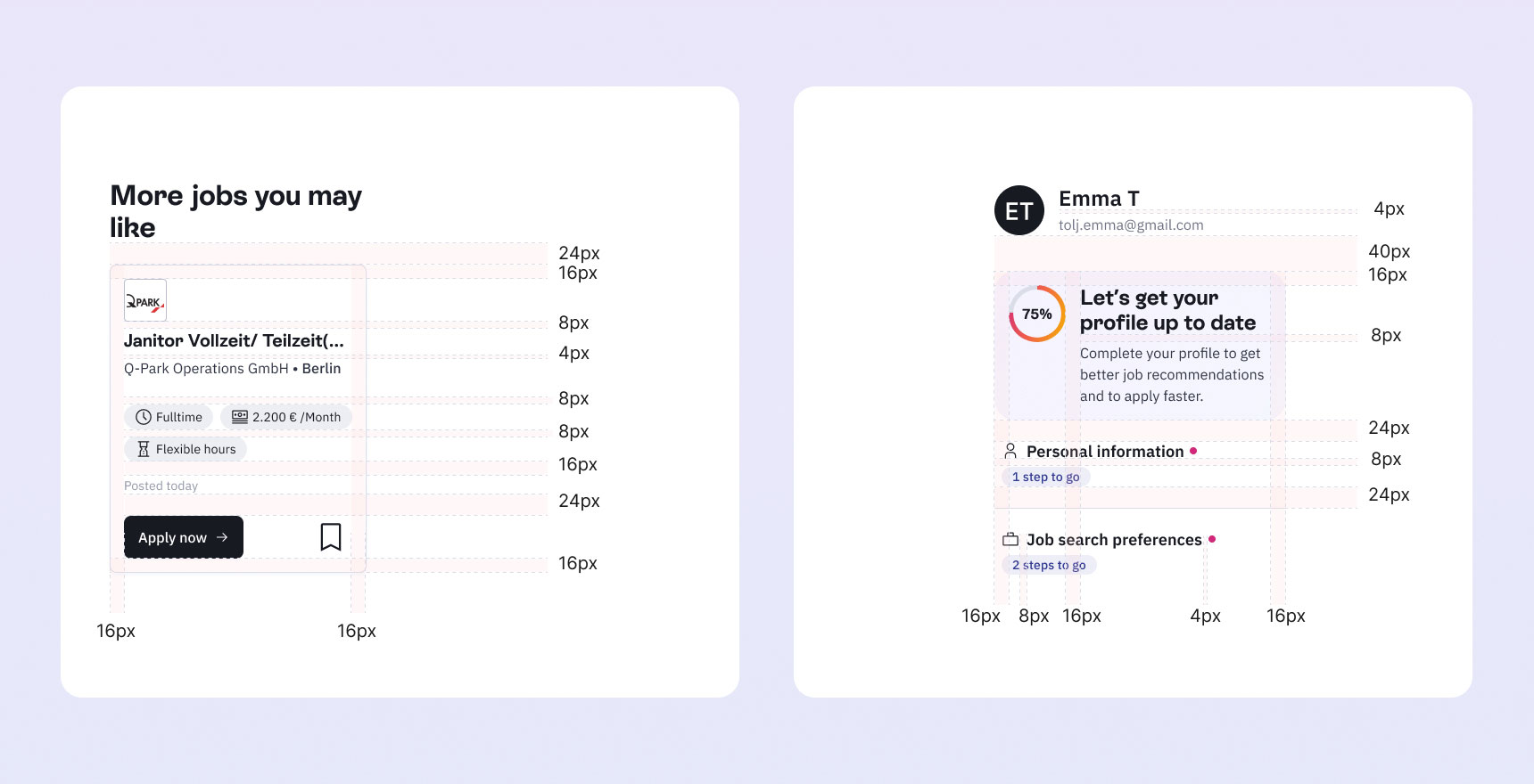
There were quite a few inconsistencies and accessibility issues with the existing implementation of the design system.

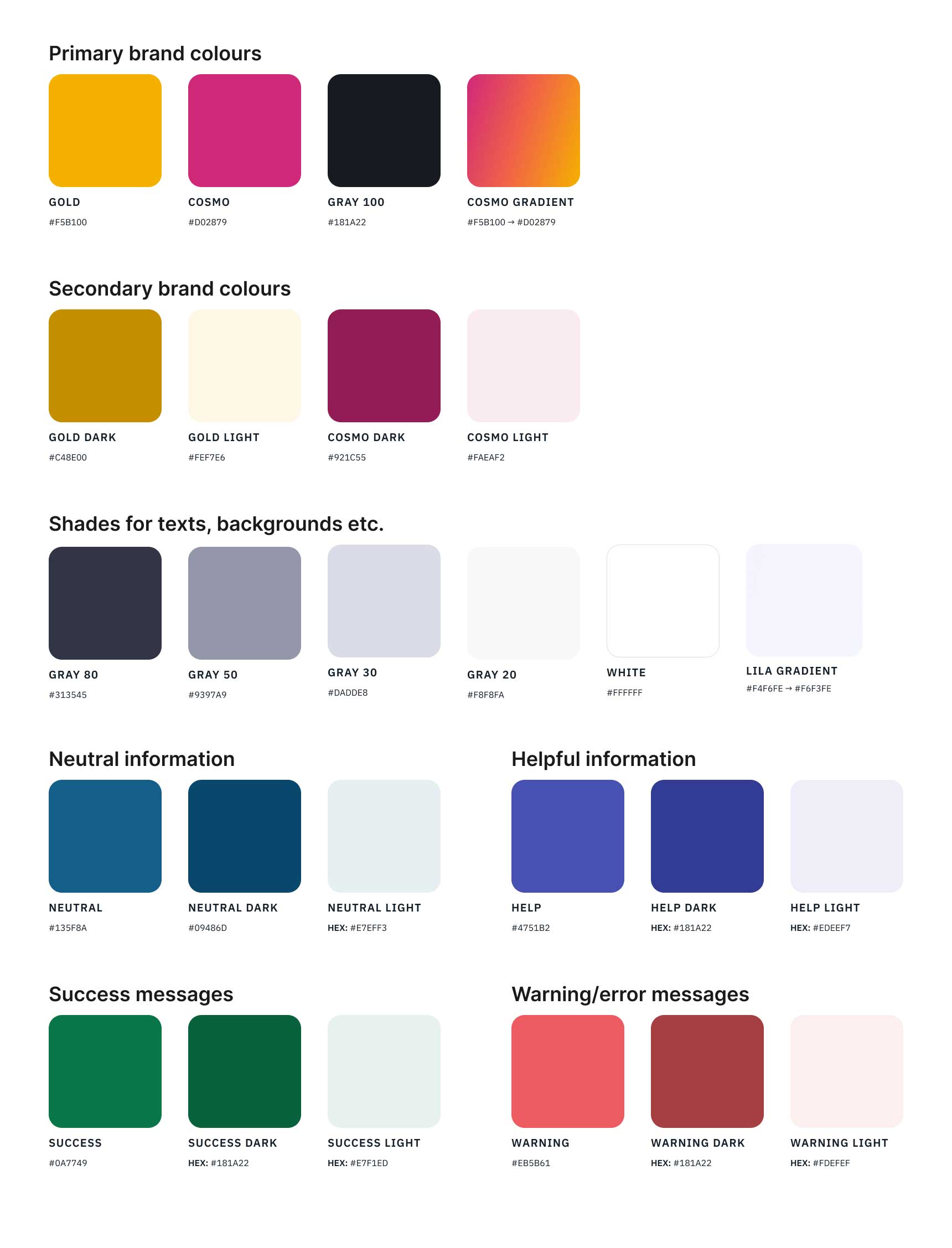
We collaborated with the brand team to come up with a new young and vibrant colour palette. The biggest challenge was to find colour pairs which had a very good colour contrast.
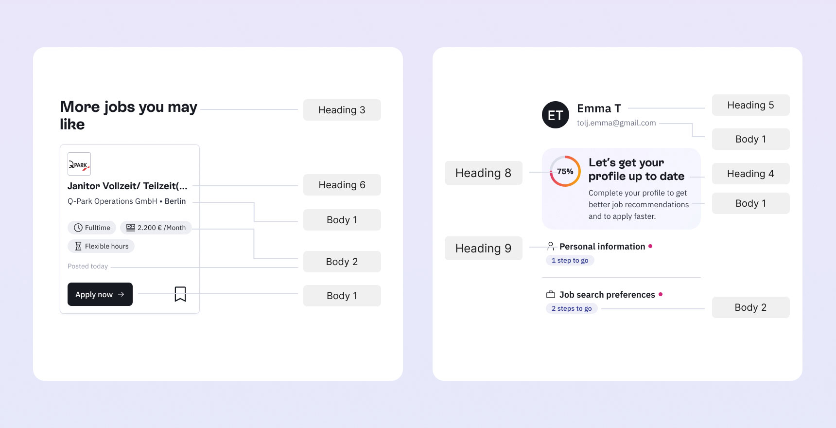
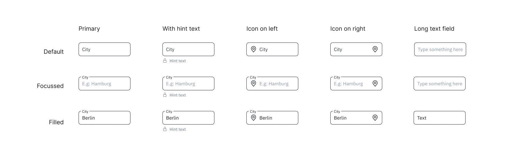
Two different typefaces were selected for headings and body copies.

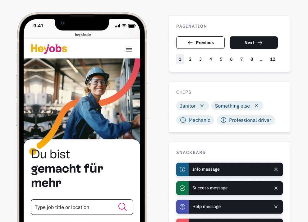
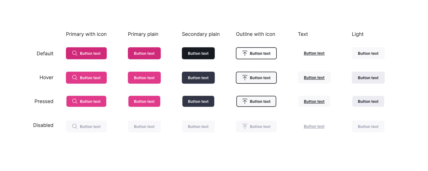
There were many variants of buttons that were extensively documented to cover all user cases. Here are a few
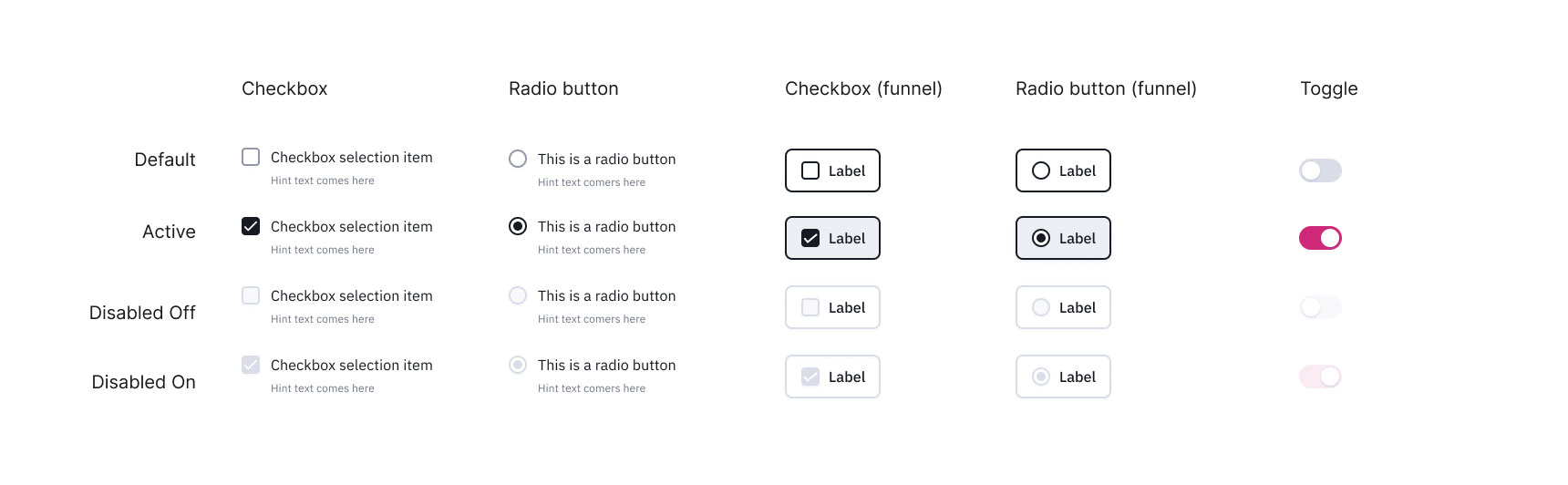
Selections were done using radio buttons, checkboxes and toggles. The Conversational Application Flow, through which the users applied for jobs, needed a slight variation of the radio buttons and checkboxes.

(Click on the image to view 2 more screens)

(Click on the image to view 1 more screen)

(Click on the image to view 2 more screens)

