HeyJobs is a Berlin-based job search platform mainly for blue-collar workers (or essential workers)- that means nurses, janitors, drivers etc.
My role
End-to end Product Design, UX writing, release planning with the Product Manager
Timeline
4-6 weeks
Outcomes
3x increase in users with qualified profile data, better job recommendations
The problem
Irrelevant job recommendations sent out by HeyJobs
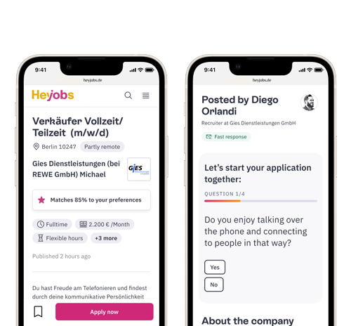
The recommendation engine worked in such a way that the longer you apply for jobs on HeyJobs, the better it learns. We needed a better solution so users could consciously decide on the type of jobs they were looking for.
"I apply for one job in Hamburg and now all I'm receiving are job recommendations in Hamburg!!"
feedback from user interviews
The opportunity
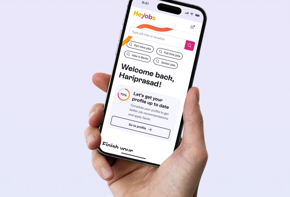
Adding job search preferences to the profile page
research & insights
user need (short term)
• Better job recommendations
• Faster applications
user need (long term)
• Profile to CV convertor
• Educational content
business need (short term)
• Lesser Cost Per Application*
• Better application quality
business need (long term)
• Reverse recruiting
• Get to know the users better
* Better user profile->Tailored job recommendations->more job applications, which means there's no need to spend money on advertising these jobs on Google/Facebook.
Finding
01
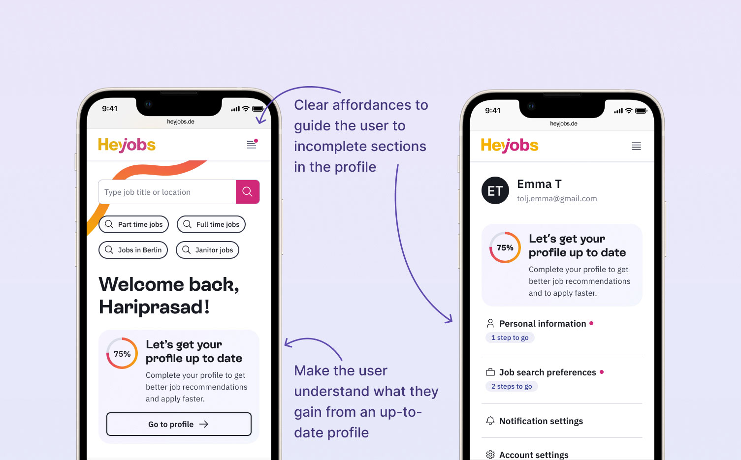
Lack of incentive
Due to lack of relevant data points on the profile, users don't see the value in filling out their existing profile
Solution
Add relevant data points, communicate user value
Finding
02
Lack of awareness
Many users don't know about the existence of a profile (because a profile is automatically created with a job application)
Solution
Lead them to the profile page
Finding
03
Confusing design
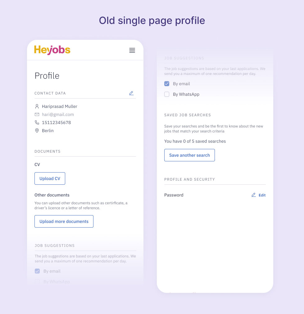
Long unstructured sections caused users to abandon the page (Bad Information architecture )
Solution
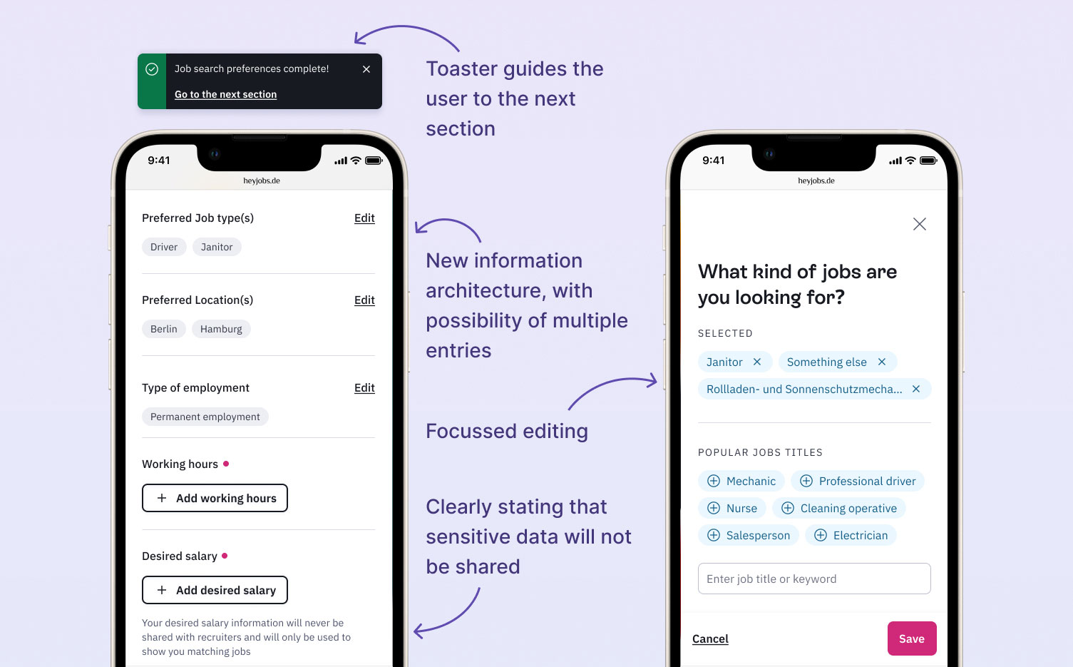
Reduce information overload
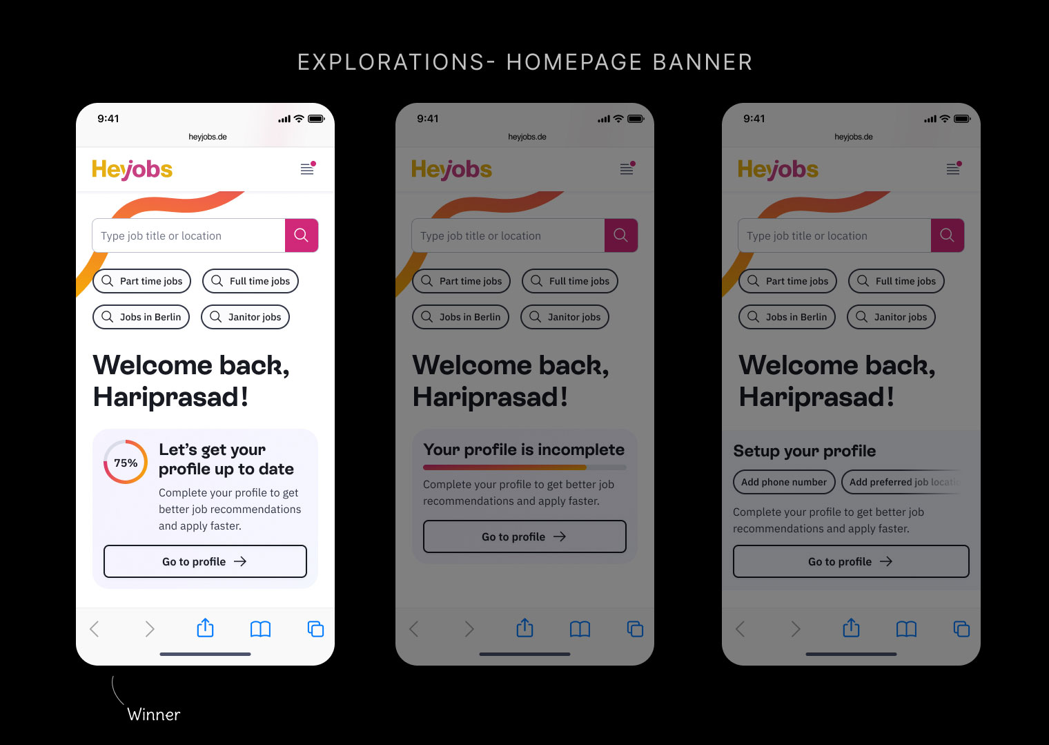
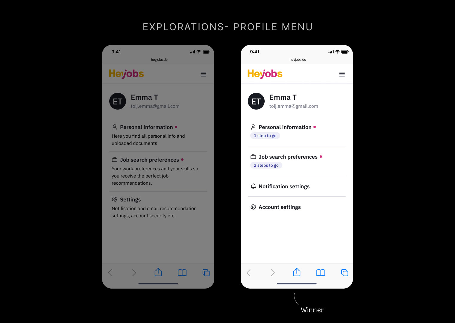
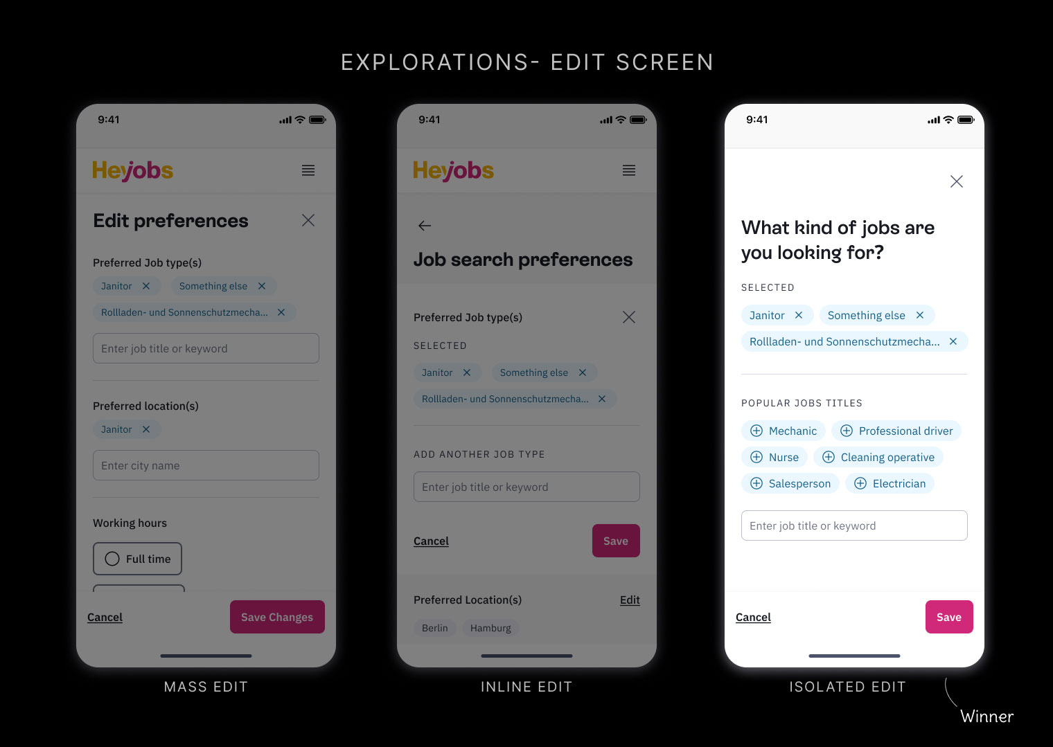
I explored various options, and conducted usability tests with around 7 users. Here are the higlights:
We also learnt...
Simpler solutions with minimal cognitive load work the best
Willingness to spend time completing the profile if helps them match with better jobs
Users cared about public visibility of sensitive data like salary expectations
The final profile page redesign focused on clarity, guidance, and motivation.
We released the new profile in 3 different stages instead of waiting for a single huge release, which gave us time to learn from the data and make adjustments on the go. This also kept the team morale high.
We realised after subsequent user tests, that the profile was not suited for very broad searchers- for Eg. People who don't care what kind of job it is as long as it is a part time job in Berlin.
3x
increase in number of unique profile visits.
3x
increase in total number of active users with qualified profile data
40%
conversion rate of the snackbar -> more users completed their profiles within the same session