HeyJobs is a job search platform for blue-collar workers. Users rarely visited their profiles, hurting job match quality. Let's find out how this problem was tackled.
My role
End-to end Product Design, UX writing, release planning with the Product Manager
Timeline
4-6 weeks
Outcomes
3x increase in users with qualified profile data
Challenge
The profile page played a critical role in helping users present themselves and to receive better job recommendations- yet engagement was low and many profiles were left incomplete- resulting in reduced value for both users and the platform.
From a product perspective, the challenge was to improve profile completion and usability without overwhelming users or increasing cognitive load.
Insights
Early analysis revealed that users didn’t lack motivation - they lacked clarity and guidance. The profile page was confusing, making it difficult for users to understand:
• what information needs to be filled on priority
• what is the benefit of a completed profile
Reframing the problem
"Users aren't completing the profile"
"The interface isn't helping the users understand how and why they should complete their profile"
To better understand user behaviour and pain points, we combined qualitative and quantitative research methods.
Research methods
• Analytics review of drop-off points
• Existing user feedback and NPS survey results
• Competitive analysis of similar profile experiences
• Internal stakeholder interviews
Key findings
Lack of awareness
Users donʼt visit their profile, many do not even know it exists (since a profile was automatically created as soon as you apply for a job)
Lack of incentive
Users wanted reassurance that completing their profile would lead to tangible benefits
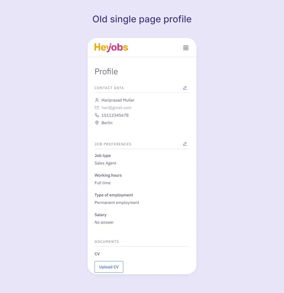
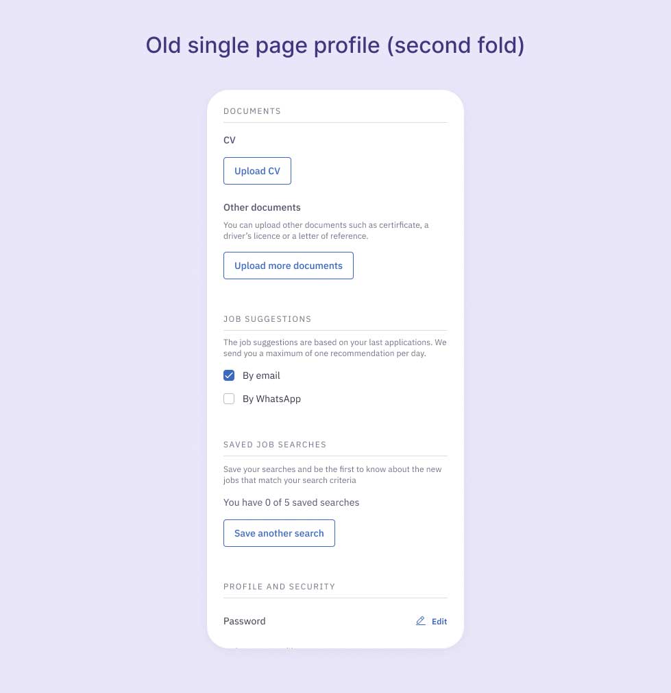
Confusing information architecture
Long unstructured sections caused users to abandon the page.

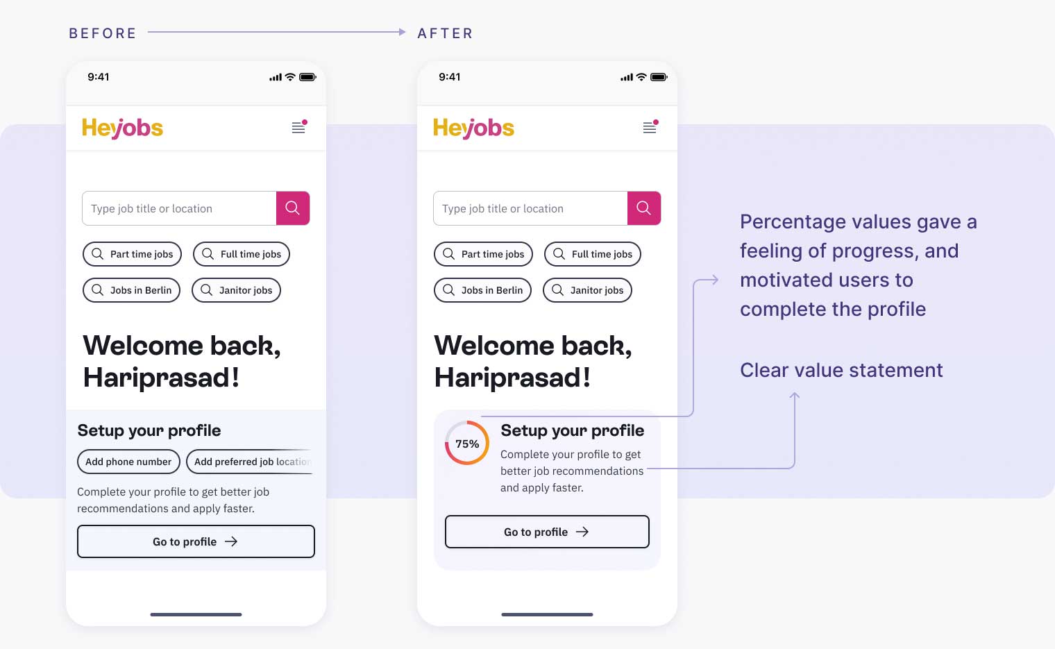
Based on the research, we focused on simplifying the experience while increasing perceived value.
Initial wireframes
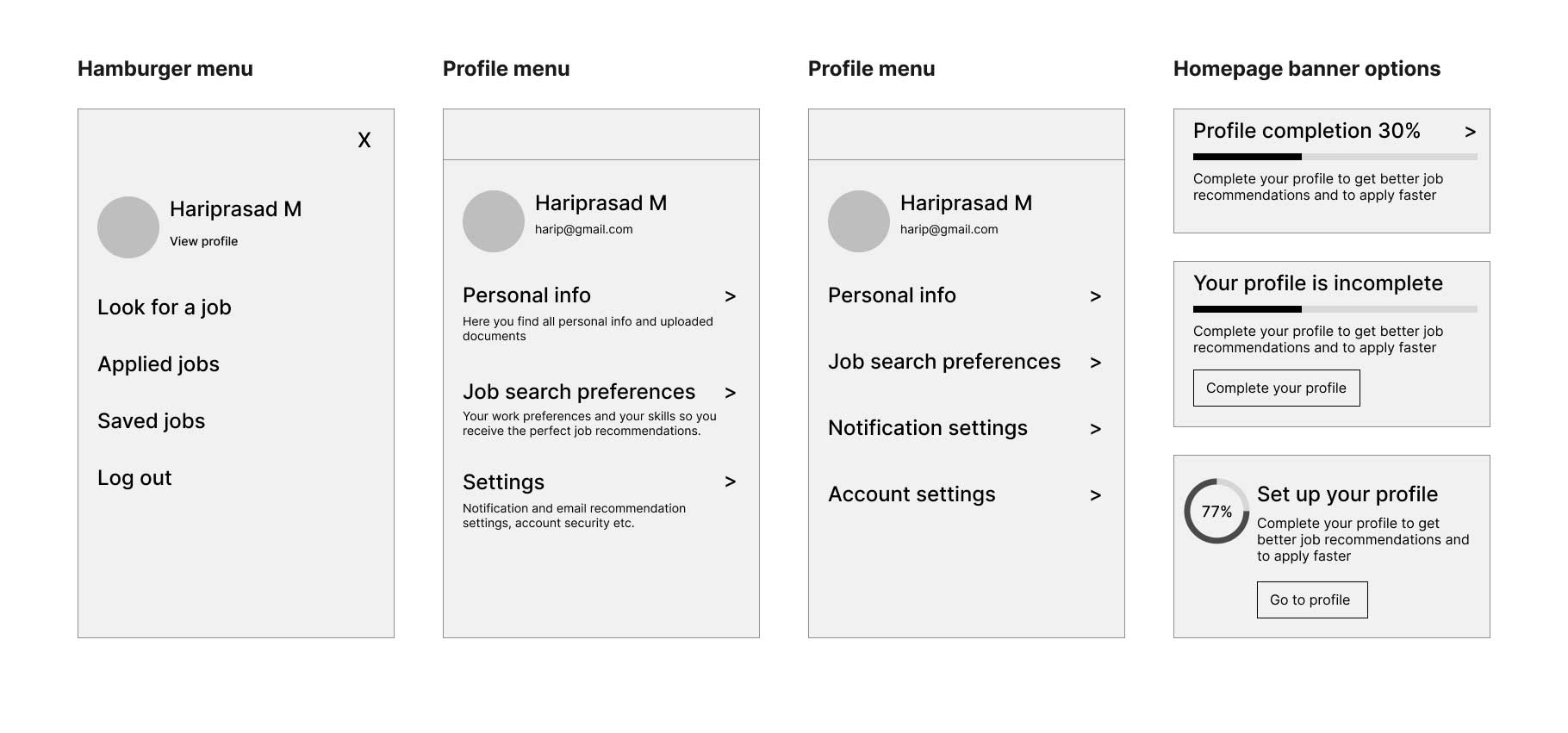
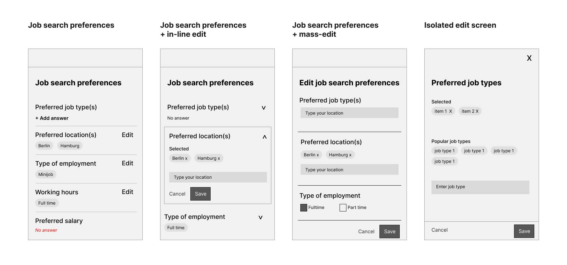
Key design decisions
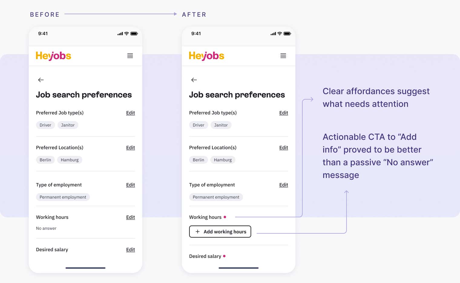
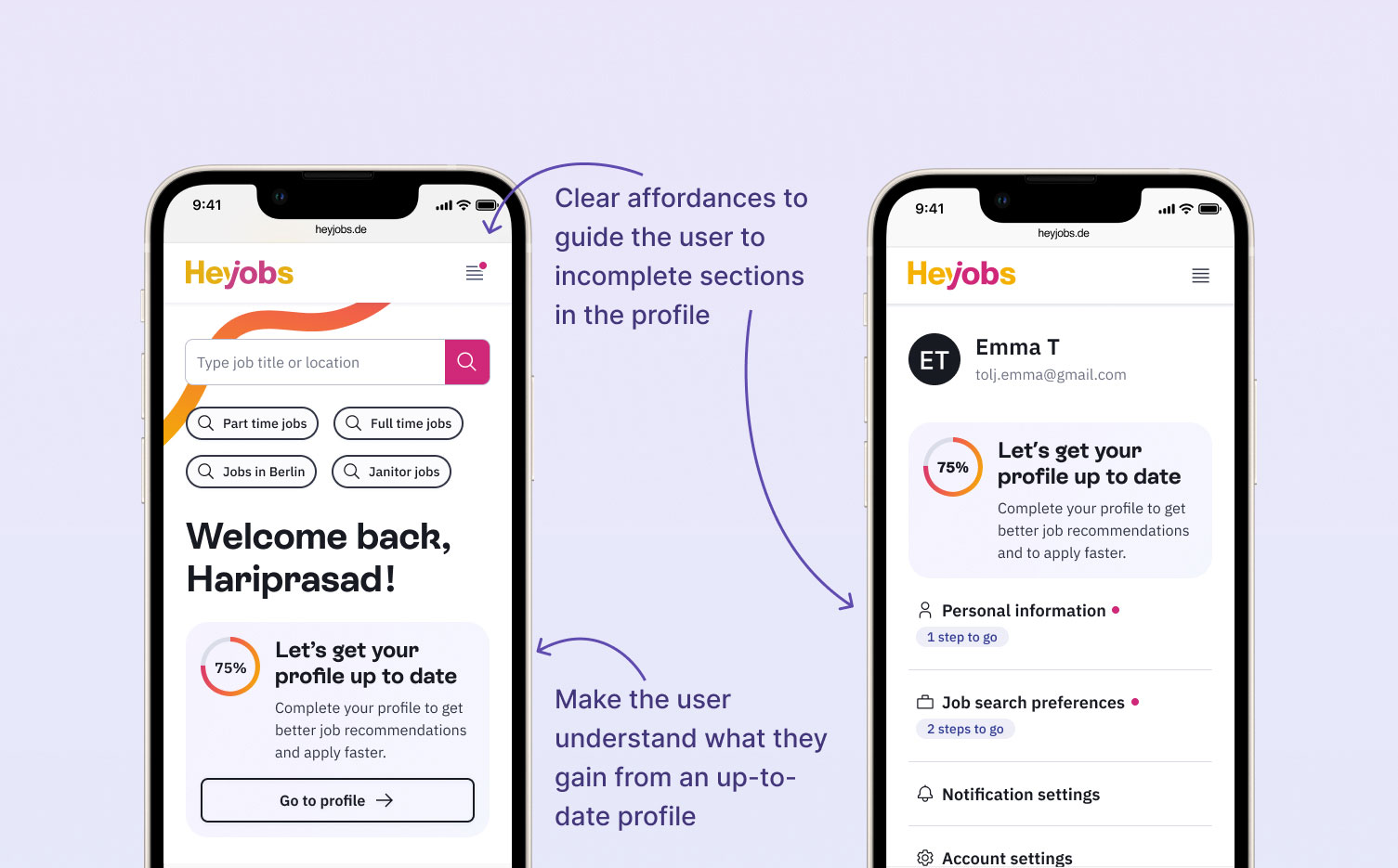
Broke the profile into clearer, more digestible sections
Introduced visual hierarchy and affordances to highlight the most important fields
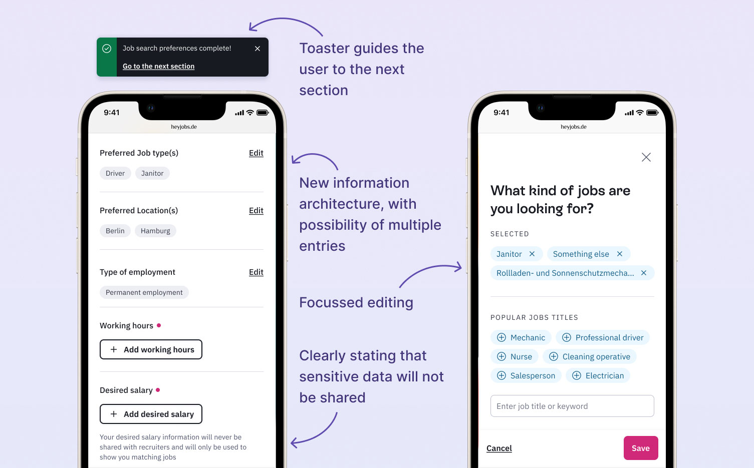
Used contextual prompts and microcopy to explain why certain information matters
Designed flexible components that could scale with future profile requirements
We tested around 4 different design ideas with 7 participants. Here are the key insights:
What we learnt
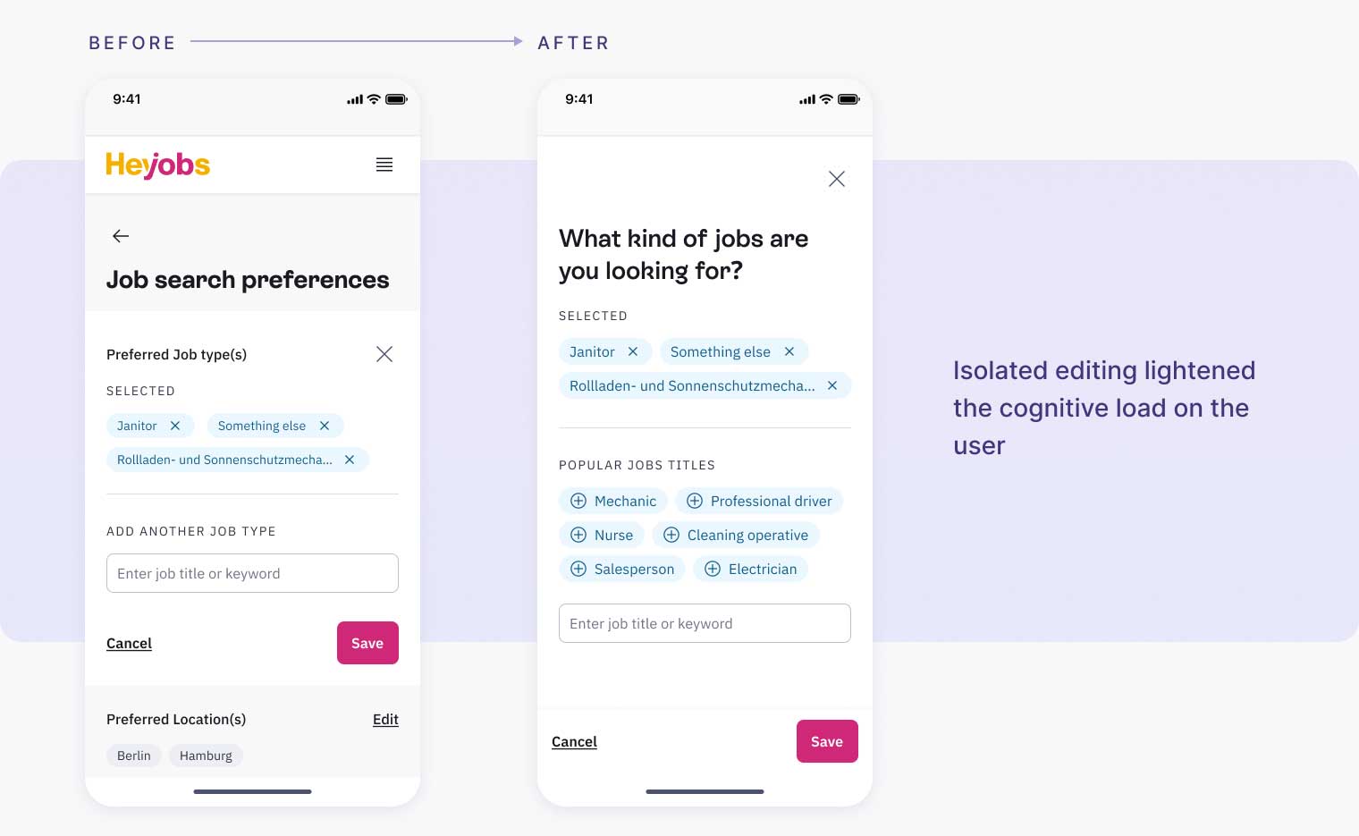
Users preferred simpler solutions with minimal cognitive load
Microcopy needs more iteration
The new information hierarchy was much easier to understand
Users cared about public visibility of sensitive data like salary expectations
The final profile page redesign focused on clarity, guidance, and motivation.
Value to the user
😎 More control over profile data.
😍 Better job recommendations.
⚡ Faster applications because of stored data.
Value to HeyJobs
🤝 Get to know the users better
🚀 Starting point to build other features (Eg. CV parser)
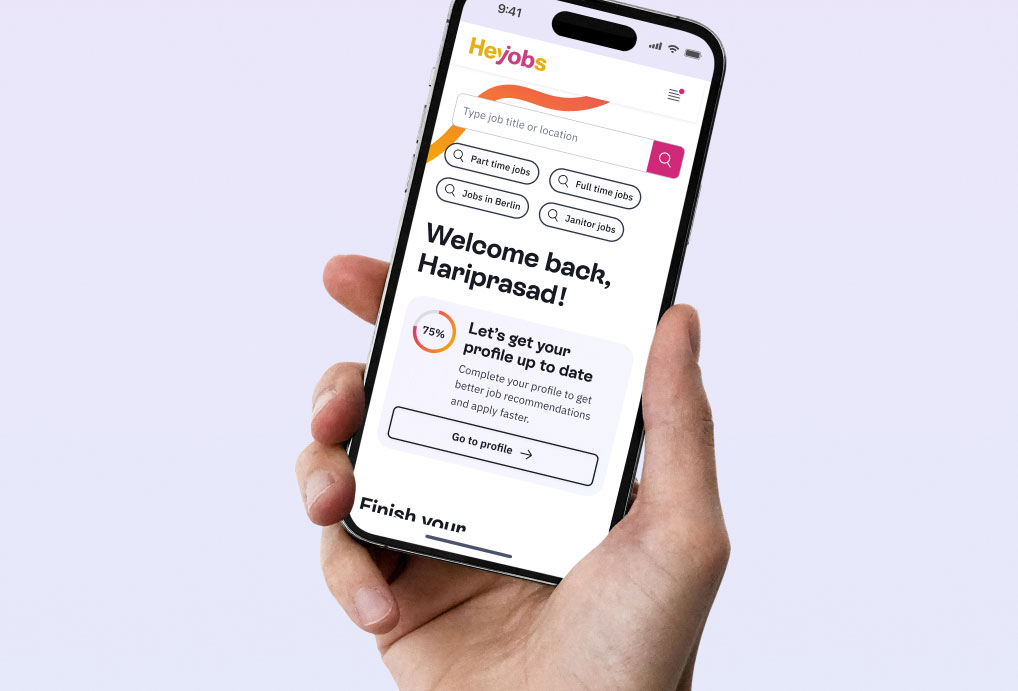
The 'Hook to Profile' feature (which is the name for the banner on the homepage) was a great success, resulting in many profile visits and profile completions. It was planned to experiment the position of this banner in other pages (such as the end of the application flow) to see which one converts the best.
We released the new profile in 3 different stages instead of waiting for a single huge release, which gave us time to learn from the data and make adjustments on the go. This also kept the team morale high.
We realised after subsequent user tests, that the profile was not suited for very broad searchers- for Eg. People who don't care what kind of job it is as long as it is a part time job in Berlin.
3x
increase in number of unique profile visits, indicating success of the 'Hook to Profile' feature
3x
increase in total number of active users with qualified profile data
40%
conversion rate of the snackbar, significantly increasing the number of users who completed their profiles within the same session