The Job description page (JDP) has among the highest traffic on the job search platform HeyJobs. We wanted to improve the conversion rate of applications from the JDP, and optimise the usability of this page.
My role
End-to end Product Design, Experiment planning with PM
Timeline
6-8 weeks
Outcomes
2.4% increase in number of applications submitted, 105% increase in usage of 'Save job' button
Challenge
The JDP was a key business page, since it had a lot traffic and generated most of the revenue for HeyJobs. The main challenges were:
• A minor lift in conversion meant a spike in revenue- the converse was also true.
• Changes in the JDP design needed to be translated to job cards and emailer designs.
• Adding complex features meant a lot of work on the recruiter platform back-end.
The biggest constraint
A complete revamp of the JDP would take a long time. We needed something which can be executed quickly and had high impact.
How might we
make it easier for the users to scan the JDP and decide if the job is a good match or not.
To better understand user behaviour and pain points, we combined qualitative and quantitative research methods.
Research methods
• Analytics data from Amplitude
• User recordings and heatmap data from HotJar
• Analysing existing user feedback
• Maze survey (with around 25 responses) to prioritise the different sections
Key findings
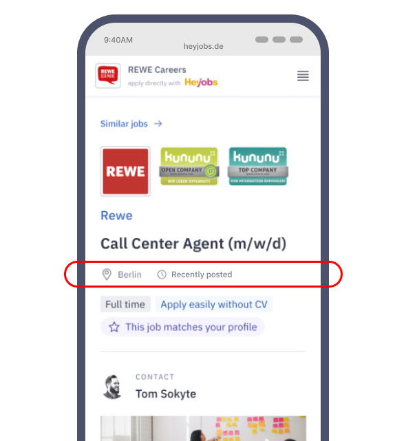
Cluttered first fold
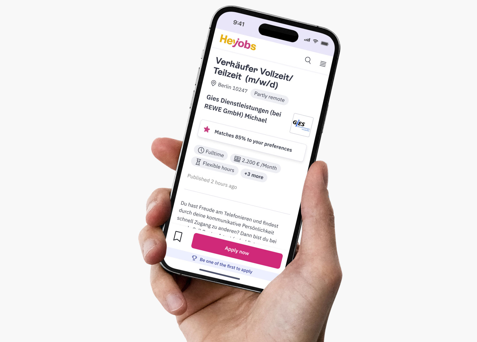
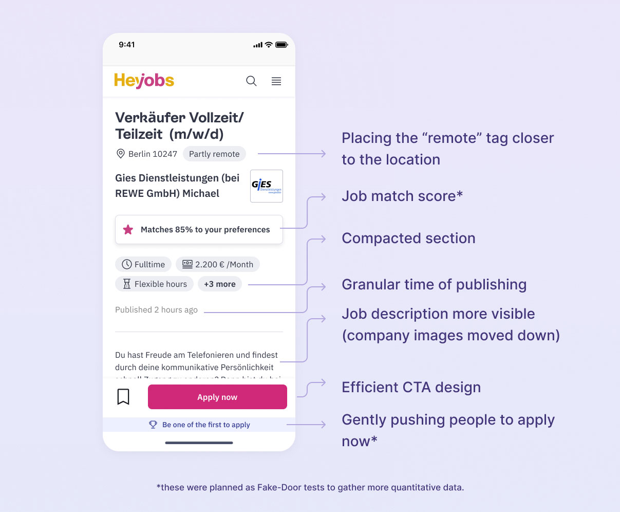
The first fold was cluttered with too much irrelevant info which confused the users. Our maze survey already showed us that recruiter name, company images, and badges (such as "Best place to work 2024") were not important enough to be on the first fold.
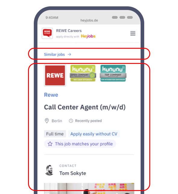
"Similar jobs button" placement
This button had a usage of around 0.2%- was thereby taking up unnecessary real estate.
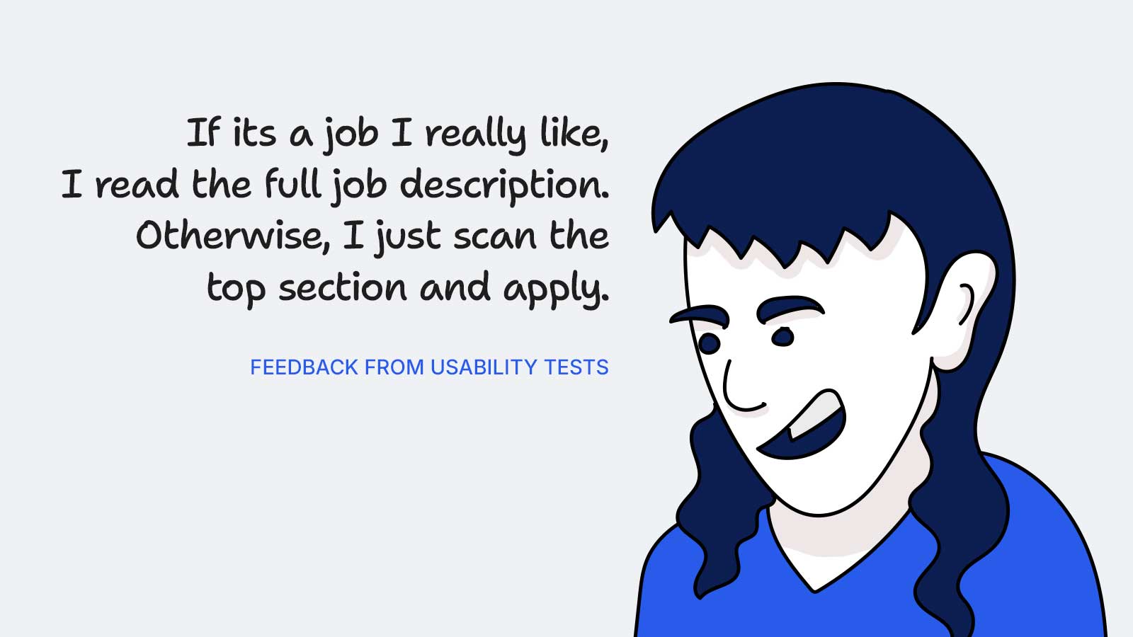
Job descriptions matter
Heatmap data showed most of the users scrolling exactly till this point on the page.
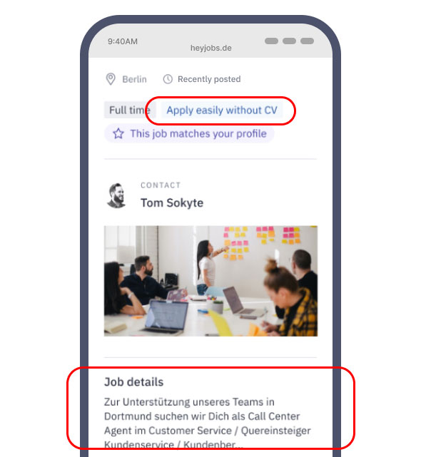
"Apply without CV" caused frustration
Even though the application could be sent without a CV, the companies contacted the applicants after a week to ask for the CV- this frustrated the users.
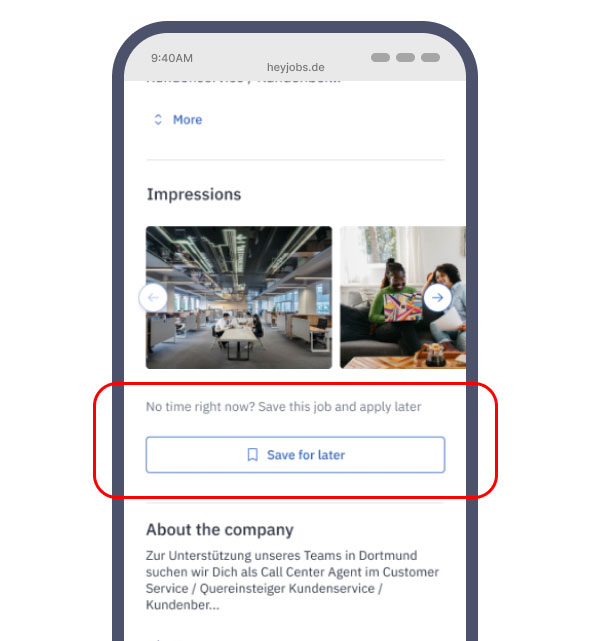
"Save job" button not seen
Analytics data showed this button had very low usage. But those who saved a job almost always applied to that job. This meant the button had potential.
Time of publishing too vague
"Recently posted" was not good enough. Users preferred more granular data (Eg. "posted 1 hour ago"), as we found out in user interviews
Location could be more specific
Adding a PIN code or the district name would provide more value than a broad city name, as we found out in user interviews
The low hanging fruit
It was obvious that we needed to prioritise the first fold and then tackle the rest of the JDP at a later stage
Our Design Lead led a "How Might We" workshop with the stakeholders. Here is a brief visual summary of the decisions we made:
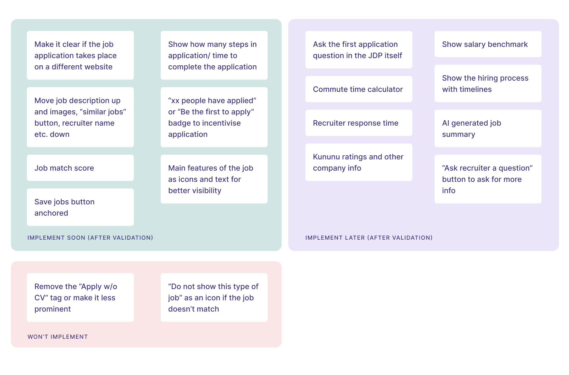
design decision
01
Concentrate on improving the first fold
design decision
02
Make components that can be adapted to the job cards and emailers.
design decision
03
Every change needs to be validated one at a time by running experiments
We conducted 2 rounds of user tests with around 10 participants for the whole of JDP. Here we highlight the takeaways only for the first fold:
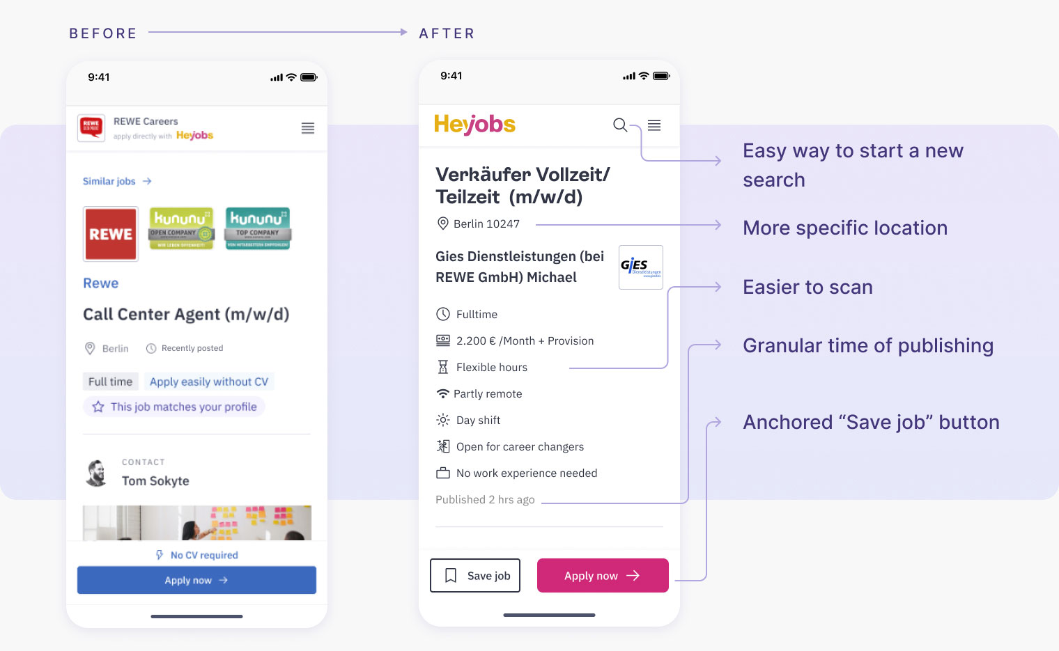
What we learnt
The new design was way easier for users to scan
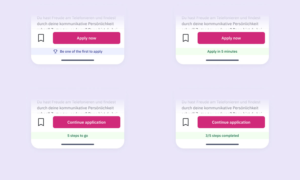
Users were a bit skeptical of messages like "be one of the first to apply"- but we thought this needed more quantitative data.
Experiment setup for the anchored banner
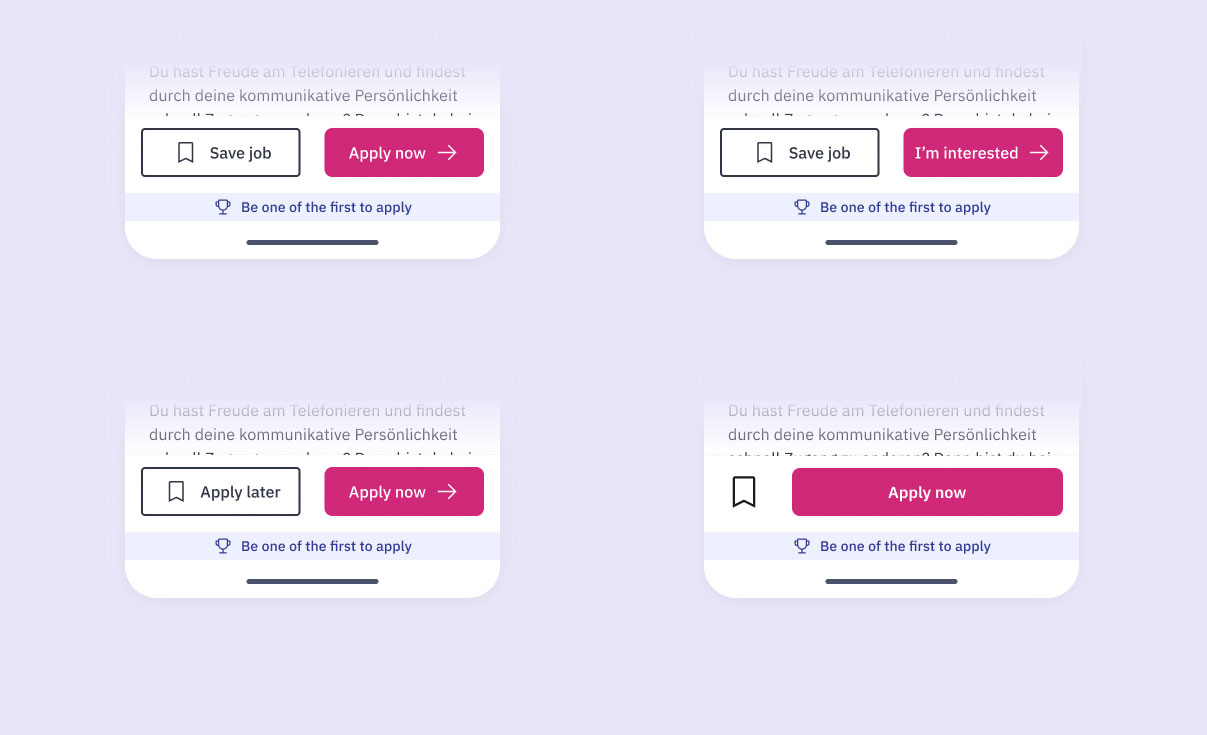
Experiment setup for the anchored CTAs
The final design of the first fold
Good to know
The "Job match score" was planned as Fake-Door test, although turning it into a real feature would be a much bigger task.
2.1%
increase in clicks on 'Apply now' button, indicating improved user engagement -> due to decluttered first fold
2.4%
increase in applications submitted, reflecting a more streamlined and effective user journey -> due to decluttered first fold
105%
increase in the number of jobs being saved, with no difference in the application submissions -> due to anchored "Save job" CTA
Setbacks
There was a major pushback to removing "Apply without CV" tag, since this is a way for HeyJobs to generate revenue.
We had to move the company images back to the top because of client (companies who post the job ads) requirements- though this did not affect the CVR significantly.

